Common Colour Adjustments
Adjusting colour can be a great way to balance out an image, especially one with tricky lighting. There are times when using the white balance tool does not cut it and that is when using colour adjustments come in handy.
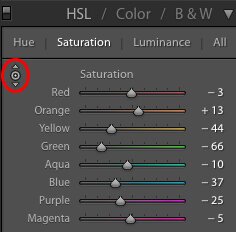
There are a few ways to adjust specific colours in Lightroom. The first being the Colour panel found between Tone Curve and Split Toning. You can adjust specific colours with hue, saturation and luminance, changing all the colours in that range for your image. Another way to view the same information is through the HSL button that organizes each colour by their hue, saturation and luminance. Depending on how your brain works, you can choose which view works best for you.

Making adjustments with these panels requires a little understanding of colour tones and how they relate to your image. Here is a quick guide of common problems colours and their respective colour range.
Skin - Orange (some red)
Grass/Trees - Green (some yellow)
Sky - Blue (some aqua/purple)
Tungsten Light - Yellow
Wood - Yellow
1. YELLOW
Yellow is a tricky colour to handle and most neutral coloured surfaces have a yellow cast when indoors because of unnatural light sources. Tungsten light is the most common culprit but can also be some warmer LED lights and fluorescent lights. These lights naturally give off a very warm light that interprets as very warm in images. An example would be a church or cathedral with white or grey walls; if you are a wedding photographer you have spent some time here. By dropping the saturation of the yellows, the background becomes much more natural looking allowing you to white balance for your subjects. This is also the case for wooden backgrounds such as barns and wooden interiors that are unnaturally lit. For wooden backgrounds, it will appear as a green cast but is actually a yellow tone that can be scaled back by de-saturating the yellow slider. Again, if you are unsure what colour you are trying to desaturate use the selective colour adjust tool through the HSL panel.

2. BLUE
Blues are a common colour to correct when there is a lot of backlight present. Indoor images are going to be warmer with an unnatural light source most of the time, while natural light will appear cold in contrast. Some common examples would be a indoor ceremony, backlit by a large window or a tent reception with warm lights and natural light pouring in the open sides. By dropping the blue saturation you can help blend cooler natural light in the image while maintaining warmth from your indoor light.

3. ORANGE
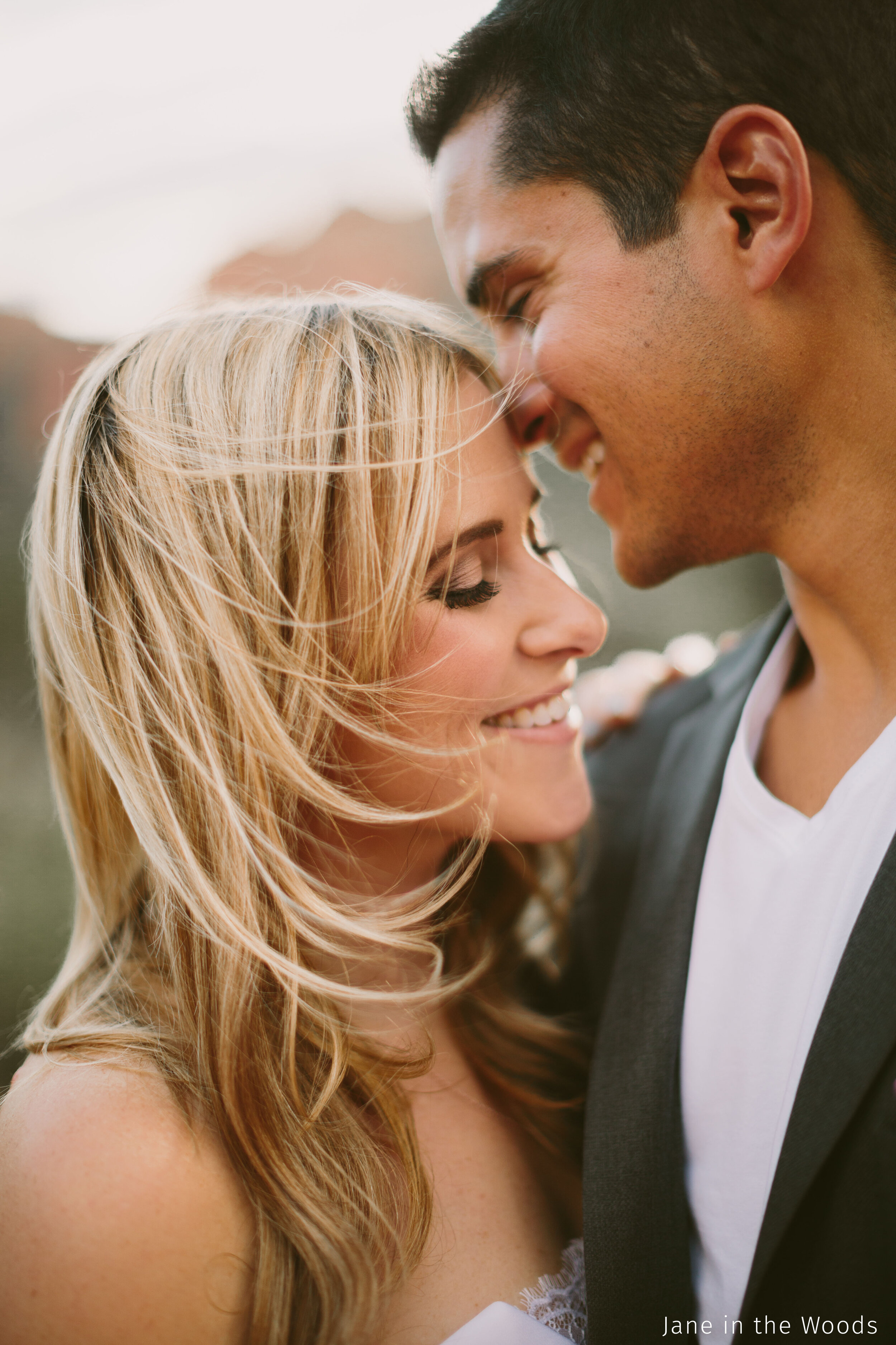
Last common adjustments is orange saturation, and this pertains to skin. Increasing or decreasing the orange saturation is a great way to make small adjustments in tricky situations. Once you have your hues locked in on the orange slider, you should not have to make large adjustments unless your light source changes in which case small adjustments (+/-1). One trick that we like to use is the luminance slider to brighten faces when skin tones are looking muddy and exposure does not help. By moving the slider to the right (increasing) the orange tones will be brightened without affected the rest of the image. If you find yourself brushing faces with an exposure brush, try this one to save some time!
4. HSL
Adjustments can also be made through the HSL panel with the selective adjustment tool (not official name, just what we call it!).
This tool is pretty amazing, and if you are wanting quick adjustments while Lightroom does all the tricky work here is your answer. This tool isolates the colours that your mouse is hovering, and will raise and lower saturation, hues, and luminance by holding left mouse click down and moving it up and down. No need to guess what slider adjusts specific colours anymore. For example, adjusting the saturation of a person’s skin will affect orange the most, but will also adjust the red and yellow saturation that is present. We have a small article explaining in more detail the effect this can have for skin tones!

This feature is a great way to quickly change colours and also learn how different tones and hues work together!
Some common indoor colour corrections that we make are yellow, blue and orange saturation.
If you have any questions, shoot us an email at hello@postpartner.com!